From a brochure mockup to a website redesign.
This project started as a brochure design and after several friendly discussions, getting to know each other and what styles and colors the client liked, it turned into a website redesign. They wanted something with a bit of artistry, yet clean and to reflect some of the influences in acupuncture methodologies and culture.
Color and Design
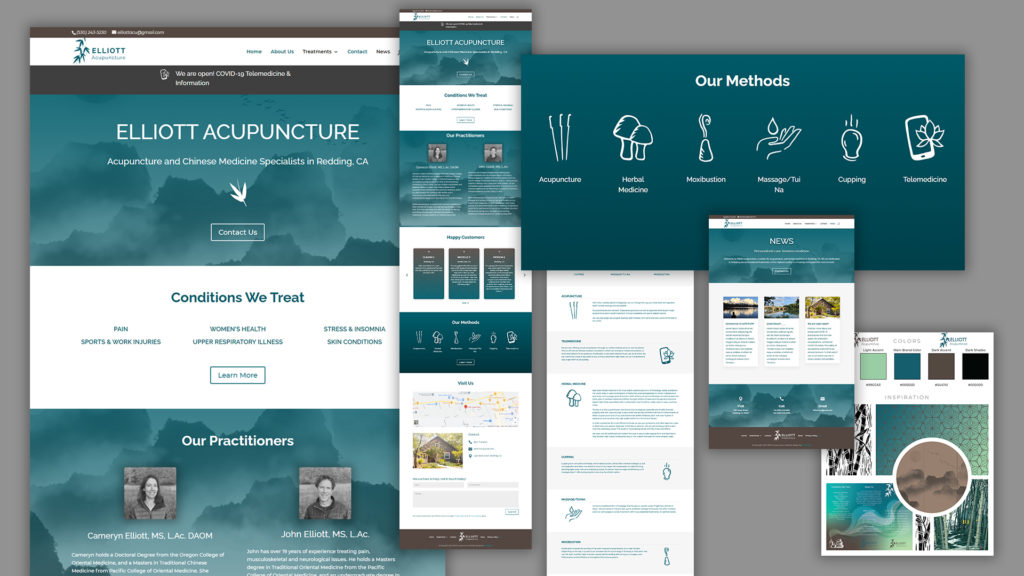
I started by sourcing textures, images, and colors that I thought would resonate, and even a preliminary mockup brochure before it turned into a website redesign. At one point in the process, the client felt maybe getting a website redesign was a better first project. So, I created a few new color schemes and mood boards to hone in on the client’s likes and dislikes. The chosen palette (below) was inspired by the color scheme used in the preliminary brochure mockup. Then the planning of sitemaps, layout, content procurement, and collaboration began.

Hand-drawn Icon Design and Illustration
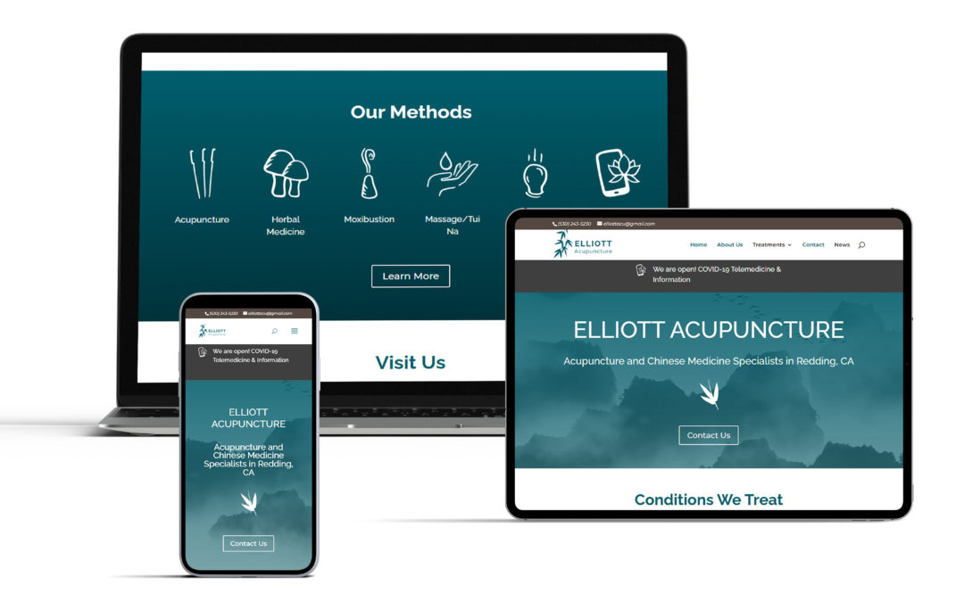
The client did not want any generic iconography or imagery on the website. Knowing I also create art and illustrations, they asked me to make some custom icons. We landed on creating icons to represent the main modalities of their service offerings; Acupuncture, Herbal Medicine, Moxibustion, Massage, Cupping, and Telemedicine. At the time, the client was expanding their virtual consultation service, and we were not sure what to name it. Little did we know that soon, when the Covid-19 pandemic hit, it was going to be a very important aspect of serving their clients. Quickly the term telemedicine became well known and thus became the name for the last service offering icon.
I hand drew many variations of these icons. These were on my brain everywhere I went. Always with a pen or pencil ready. An entire set or two were drawn while waiting in line at a customer service counter. I put together what I thought were the strongest and presented them to the client to see which ones they liked best and felt represented the services well. From there, I digitized the favorites, unified the sizes and line thickness while still maintaining the organic hand-drawn feel.
You can view the finished project at elliottacupuncture.com.